Comic - Papercuts & Inkstains #1 and 2

I honestly believe the world of High-Frequency Trading and major banks’ dark pool share rip-offs are easier to understand than the world of comic books right now, and not even the guys on Wall Street actually know how HFT works. I gave up on comics in the 1990’s. The big two of DC and Marvel with their ever changing stories and reboots and tinkering just lost me completely and I don’t have the staying power to get messed around or the money to help a greedy corporation shit on their readers from a great height. I do however have loyalty to writers and artists. I still read Tank Girl after all these years, due to my love of Jamie Hewlett, I ventured back into Marvel briefly as Monty Nero of Death Sentence fame had a story in an issue and Death Sentence is now the bar with which I judge all other comics, but most importantly I find the world of webcomics and creator owned projects a fascinating one. Unlike High-Frequency Trading, or the DC/Marvel battles, there is little or no competition in the world of creator owned projects. If one person makes a success, which to me is getting a project into Titan Comics, he or she immediately shares the secret of their success with the rest of the comic loving world. Artists flit between many different projects, writers often share stories with someone else for fun and no payment and letterers put their heart and soul into various projects, not favouring one over the other. In fact the world of indie comics is like an Anti-Big Two, the cure to a disease many of us do not know we’re suffering from yet. The only problem in the world of creator owned comics is us, the reviewers and websites.
We often can’t help but compare the work we get sent to DC or Marvel and, when we don’t and take the project at face value, we run into another of the common problems we have created – we know everyone! Social networking is the main tool for comic creators and, as website editors, reviewers, bloggers, we have nothing better to do with our time than sit on Twitter (any journalist in our line of work that says they are too busy all the time to be on social networks, check their timelines, they’re lying) and so we get to know an artist, he recommends someone else’s title, which leads you to talk to a writer, he or she mentions a letterer, and the next thing you know you are like the strange cousin, allowed to the party and everyone talks to you but they know you can’t draw. This leads to the question of whether we can review a product fairly. I have always considered myself opinionated enough that any kind of feelings I have for someone involved in something doesn’t matter. I genuinely don’t care enough about niceties to blow smoke up someone’s arse, so I think I can be fair in a review, but then you see me on Twitter talking to these guys and I can see where you might think I am on the take so to speak. It’s important you know my feelings as stated above as I am now reviewing the first two issues of Papercuts & Inkstains from Madius Comics, which involves a man I deem a friend in Robin Jones. So here are my thoughts, as fair as I can be, and it’s up to you whether my musings make any difference as to whether you seek out the comic or not, which is how reviewing should be, a guide not an instruction.

Papercuts & Inkstains #1
Written: Robin Jones
Artists: Nick Gonzo, Kevin Pospisil, Mike Smith
Cover: Dan Butcher
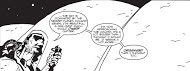
From the hectic first story, No, which finds a company employee almost refereeing some strange monster battles before having to clean up the mess, through the zombie tale, By ‘Eck on Earth, which is possibly the most humorous take on a flooded genre ever created, to The Profits of Doom what you realise is, this is funny. Not funny pages like on a Sunday morning funny, nor ironically funny because it’s so bad, far from it! Too many comic anthologies these days take, for example, the zombie genre and do very little with it. I am very bored of zombies, I know a lot of other people that are also very bored of zombies but, when you put the genre in a Yorkshire accent and play out a zombie attack like it’s just another day then you are onto a winner. Jones is more famous for being a letterer these days but I know the man can write through my own personal dealings with him and now the world gets a glimpse of his twisted humour which I can only hope leads to more writing. The cover design by Vanguard Comic’s very own Dan Butcher is really suited to the tone the comic takes, and adds a professional gloss that I hope means the guys at Madius get taken more seriously by the world than maybe an independent does at the moment. Mike Smith and Kevin Pospisil have their own unique artistic styles and are well suited to Jones’ stories, but winning by a short head is the erratic artwork produced by Nick Gonzo for No which was more different than I have seen before.
Papercuts & Inkstains #2
Written: Robin Jones, Mike Sambrook.
Artists: Mike Sambrook, Jim Lavery, Rory Donald.
Cover: Jim Lavery
Jones is back again for Issue 2 but brings with him a different team of artists and a new cover by the excellent Jim Lavery. A favourite from issue 1 returned in the form of Jones and Mike Sambrook’s The Profits of Doom which is as idiotic as a story can get, brilliantly idiotic, written for idiots like me (‘whoops a daisy’ really shouldn’t have a place in a comic but it really works with the writing style). Mike Smith’s artwork had that immediate recognisability to it, that helped the second collection fit the feel of the first, as the other stories were very different to the stories in the first. Together Forever was written by Mike Sambrook and introduces Jim Lavery as artist and sees the police investigating the disappearance of a man who had been walking his dog, which of course had to turn into a strange and humorous werewolf tale. It was, however, the first story that again got me more excited than the rest, as Jones’ writing for Cast Adrift was perfectly complimented by the very Black and White art style of Rory Donald. The entire story, a sci-fi adventure, had a very 1980’s feel to it with great use of darkness and old school lettering that an old man like me really appreciated.
Images - Madius Comics


Post a Comment